Inspiration Spotlight: 7 Cool Travel Websites

Chad Faith
Director of Content

Are you looking for cool ideas for designing travel websites? You have come to the right place! In this post, we are sharing seven top inspirational examples on how to do web design for travel companies. Let’s take a look at some of the coolest travel websites and get your creative juices flowing!
7132 Hotel Vals
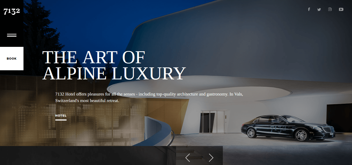
It is refreshing to see travel websites that focus on darker themes. Cool, posh, and refined are some of the characteristics that the 7132 Hotel Vals possesses – for these, the slider gallery on its homepage does a good job at reflecting these characteristics. Without needing to scroll down further, visitors can catch a glimpse of their luxurious amenities, convenient services, hotel suites, nature travel opportunities, and more. Apart from the use of inviting images to encourage visitors to find out more information about each section, the site is easy to navigate.
Conca Del Sogno
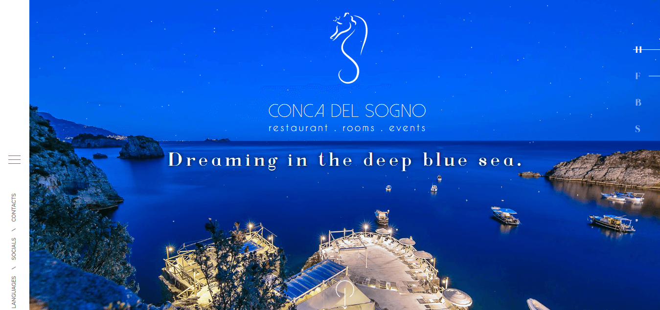
The travel website features a contemporary design, and makes clever use of relaxing background music and captions that depict the deep blue sea, crystal clear waters, beaches, and the sun. Beach enthusiasts and lovers alike will instantly connect with what the site and business has to offer. The website also offers a neat overview of what in store for travelers. From the upcoming events to the types of accommodations that are available, the site allows visitors to consolidate their travel plans in no time.
Made for Spain & Portugal
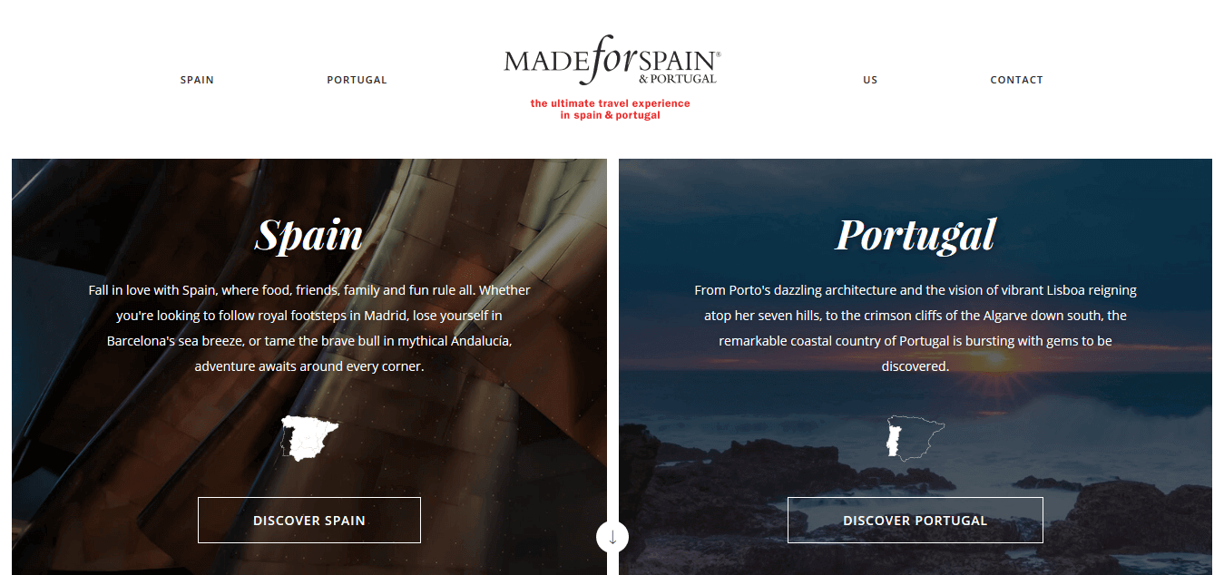
If you have niche-specific luxury travel markets you are targeting, this website design will serve well as a stellar inspiration. The website features two countries – Spain and Portugal – in a straightforward but stylish manner. The Discover Spain and Discover Portugal options on the home page allows visitors to get the information they need without having to navigate multiple pages to get to where they need to be. We also give kudos to the site in terms of showcasing their credibility and expert knowledge in the travel industry. In the same way, you can feature the awards that your travel business has earned and/or publish expert travel guides. This way, your visitors know that they found an experienced website they can trust.
Twin On Tour
If you are running or managing a travel business that provides survival courses, and have a passion for blogging, this simplistic website design concept will suit you. Just a home page that features your regular blog posts, an About Us page, a Services page (the courses you provide), and a Contact Us page will suffice. With these key focuses, updating and maintaining your site will be a piece of cake!
Shalfin Travel & Tour
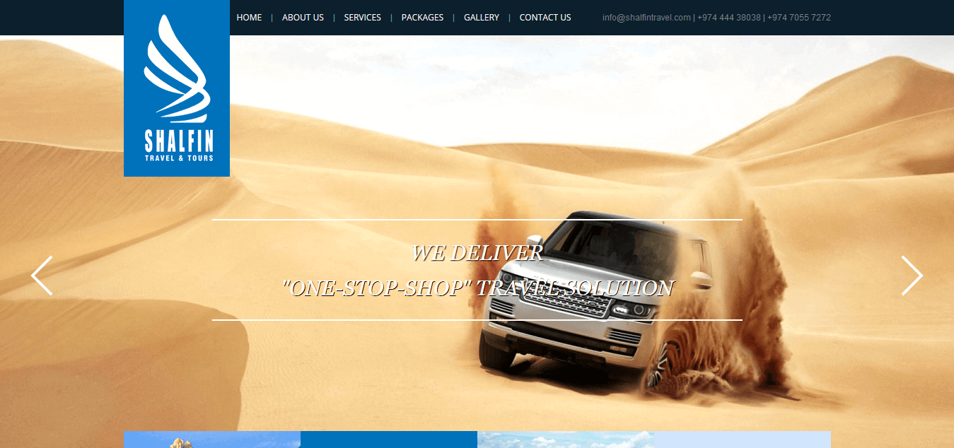
If you are offering one stop travel solutions, you may want to pick up a few design tips from this website. As many will know, flash is not recommended on contemporary website designs. However, you can perk up the look of your site by implementing some mouse-over effects. Between the top slider gallery and footer on this website, you can see a few boxes. When you mouse over them, you can see that they actually lead to inner pages such as holiday tour packages and desert safari tours that they provide. The site just makes you want to book the next available flight and get on a vacation!
Greek Tour Guide
If you are designing a website and want to use a more personal approach, check out the Greek Tour Guide website. On the home page, visitors are greeted with a big, warm “It’s Nice To Meet You.” If you want to remove the hassles of having to navigate to the inner pages, you can incorporate the site’s menu style to your own project. When you click, e.g. Attractions, the page automatically scrolls down to the appropriate section. Of course, you may still want to create dedicated pages for the destinations you offer tours to.
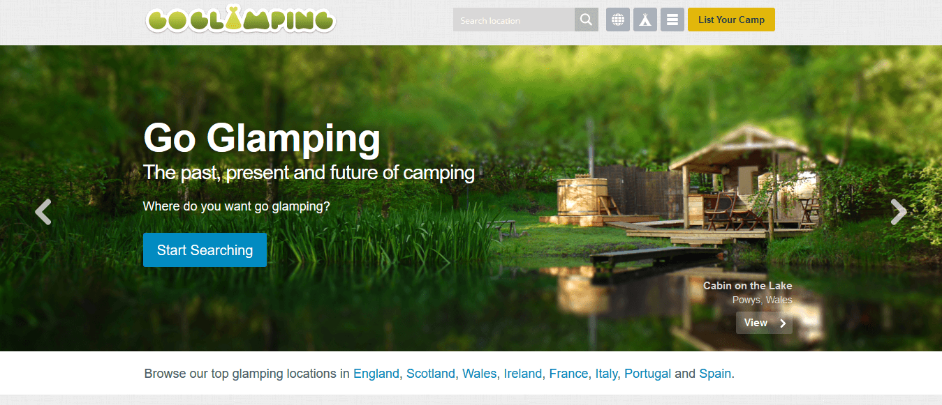
Go Glamping
If you are certain that your target market is not the wordy type and tend to look for more specific information, check out what Go Glamping does. On their home page, they have already laid out the available glamping sites that visitors can book without delay. It’s minimalistic but it’s certainly effective!
 Free
Consultation
 Free
Google Ads Audit
