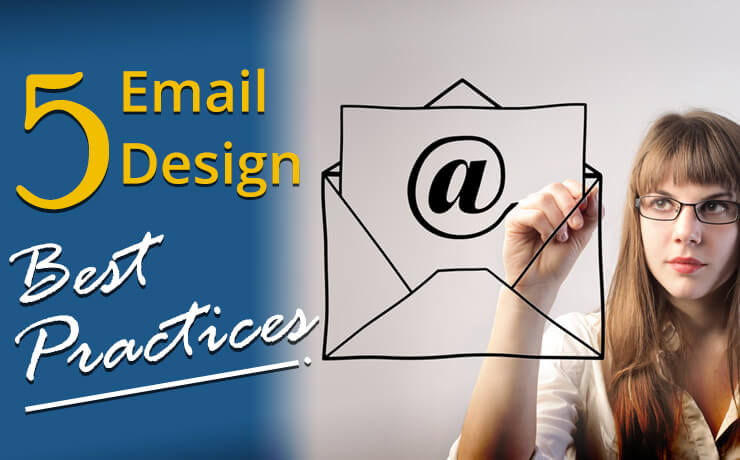
5 Email Design Best Practices

Chad Faith
Director of Content

For many small businesses, email marketing is an effective way to reach and engage one’s audience. Since the beginning of time, email has been a major part of our lives as consumers, individuals, and professionals. Give this some thought. How many people do you know does not own an email address. Chances are the answer is none. Now, with so many businesses sending out emails, how do you stand out? You need a great email design that can capture the attention of the recipient. Here are a few tips on how to become an artist of your email campaign!
Avoid Using Spam Words
Most email platforms have built-in spam filters that keep track of particular words. If your email copy contains a spam trigger word, the system will assign your email a spam score. If you can’t do without that word, you should use them in moderation. Otherwise, ensure that you write copy that does not contain spam words at all. Common spam words include:
- Being a member
- Big bucks
- Copy DVDs
- Credit card offers
- Free membership
- For just $XXX (X = any amount)
Speaking of spam, you need to be CAN-SPAM Complaint. This is not only a best practice but also a legal requirement. Your business emails need to feature your physical mailing address.
Coding With CSS Is Not Necessary
If you code your email template design using CSS, your work is unlikely to translate across different email service providers. Gmail, for example, strips CSS from the <head> and <body> sections of email templates. If coding via CSS is a must, consider inline CSS. To achieve consistent display and design, you should include <p> and <font> tags within your email design.
Tailor Email Content and Subject Lines
Certain email newsletter designs tend to perform better when they feature a personalization field. This means displaying the recipient’s user name or first name in the body or subject line of the email. This may not work if your industry deals with personal or private information. In addition, your recipients may feel uncomfortable seeing their names in those areas of the email. When you find an email provider that supports such email personalization features, you can significantly improve your click-through rate and email open rate.
Allow Recipients to Unsubscribe
This may seem counter-intuitive at first. However, if users find it hard to unsubscribe from your email, they may mark your email as spam. These actions will affect your sender’s deliverability and reputation in the future. The process of unsubscribing should be easy, i.e. simply replying to the email or via a single click.
Shorten Copy and Minimize Images
If your emails overwhelm recipients with more text than they can read, your emails are going into the junk or spam folder. You should utilize shorter text blocks that link back to landing pages, specific product pages, or full articles. When it comes to images, you should keep in mind that most email service providers’ inboxes do not load images for safety reasons. If your initial email design is image-heavy, your subscribers will mostly see blank white spaces (image descriptions can still appear if you use title and alt text). So, don’t rely on them alone to convey your message or sell your product.
Increase Link Visibility
In most cases, links in your emails should be bolded and formatted in a blue font. If your style guidelines prohibit that, your links should at least be underlined. Try not to denote a link via buttons and images. These elements may not be obvious enough to make your links stand out. If you do, there should be a corresponding text link nearby.
Be Aware Of Sizing Dimensions and Proportions
You have approximately three inches of depth and 600 pixels of length to create an outstanding email. Ensure that you include any key information, call-to-action feature, and value proposition that will compel users to keep reading in that space. As mentioned, heavy use of email graphics is not recommended due to loading issues.
 Free
Consultation
 Free
Google Ads Audit


