5 Inspiring Website Designs For Manufacturing Businesses

Chad Faith
Director of Content

Today, more manufacturing businesses are taking a digital-driven approach to market themselves. Their websites no longer look like something that you may across during the Microsoft Front Page 95 era. If you are trying to get inspired so that you can create your own web design, it is recommended that you take a look at the following website designs for manufacturing businesses before you start heading to the drawing board.
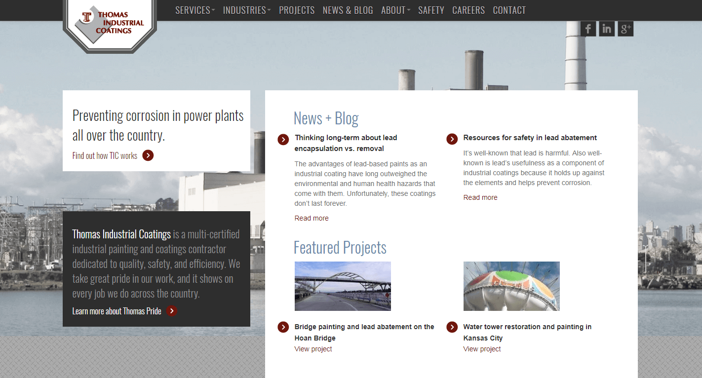
Thomas Industrial Coatings
Thomas Industrial Coatings, Inc. is an exceptional provider of painting and coatings services. Now let’s see, what do we like about the site’s design? The first few elements that caught our attention were the site’s responsive design, easy navigation, uncomplicated home page, and full screen layout. We liked the idea of the company featuring its latest news and projects on the home page, so that visitors can keep up to date with the latest happenings without having to navigate into inner pages.
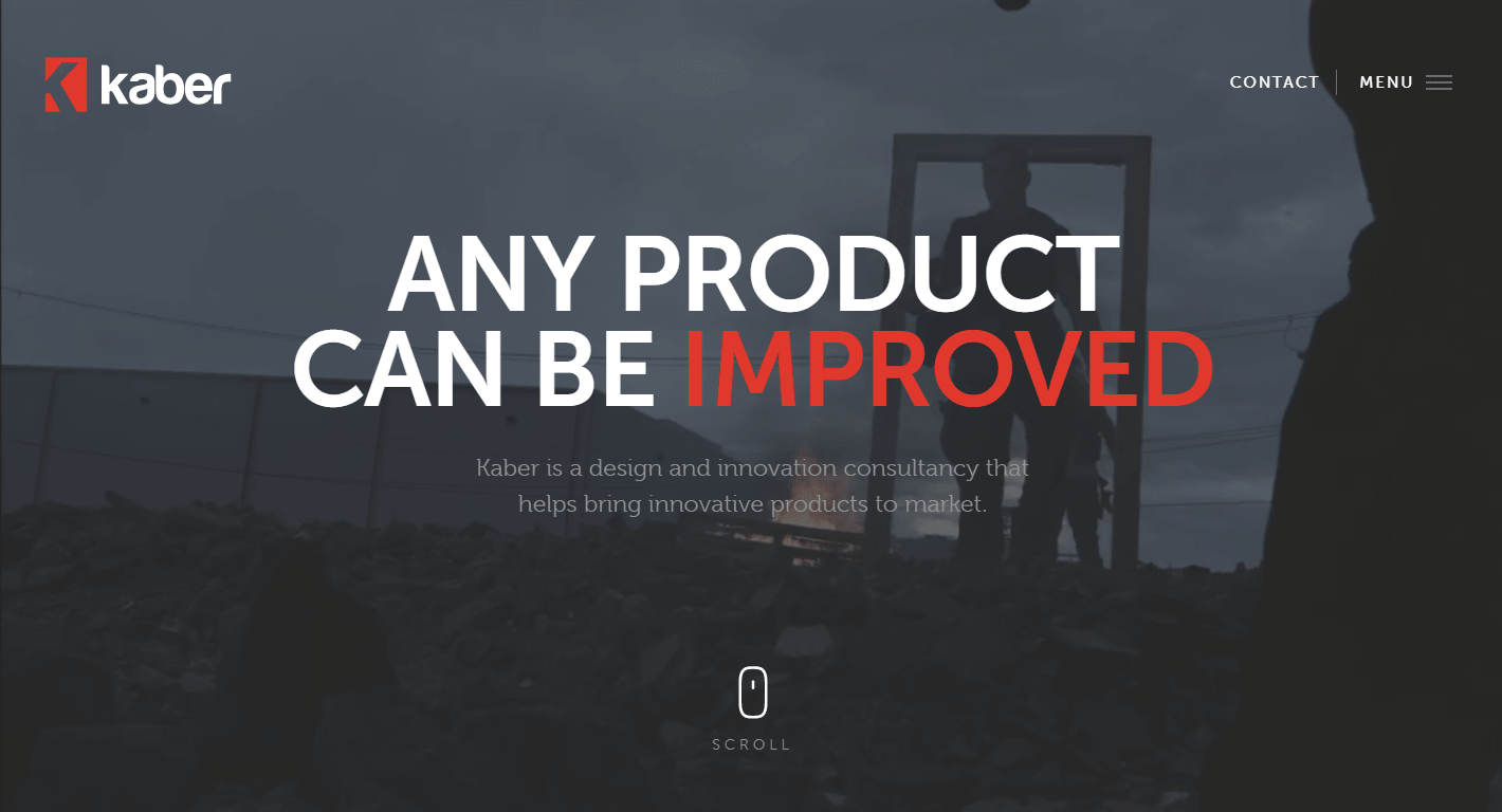
Kaber Technologies
If you are wondering what a high-quality website design looks like, no further than Kaber Technologies. Kaber utilizes its manufacturing experience to assist its partners in realizing cost effective solutions to new product development and engineering. The manufacturing company also makes smart use of full-sized photos and renderings, as well as professionally edited video backgrounds. Design & prototyping, engineering, and research & strategy are the three main areas of expertise for Kaber Technologies. They are featured prominently on the home page, but with short, concise copy. That’s another major plus point.
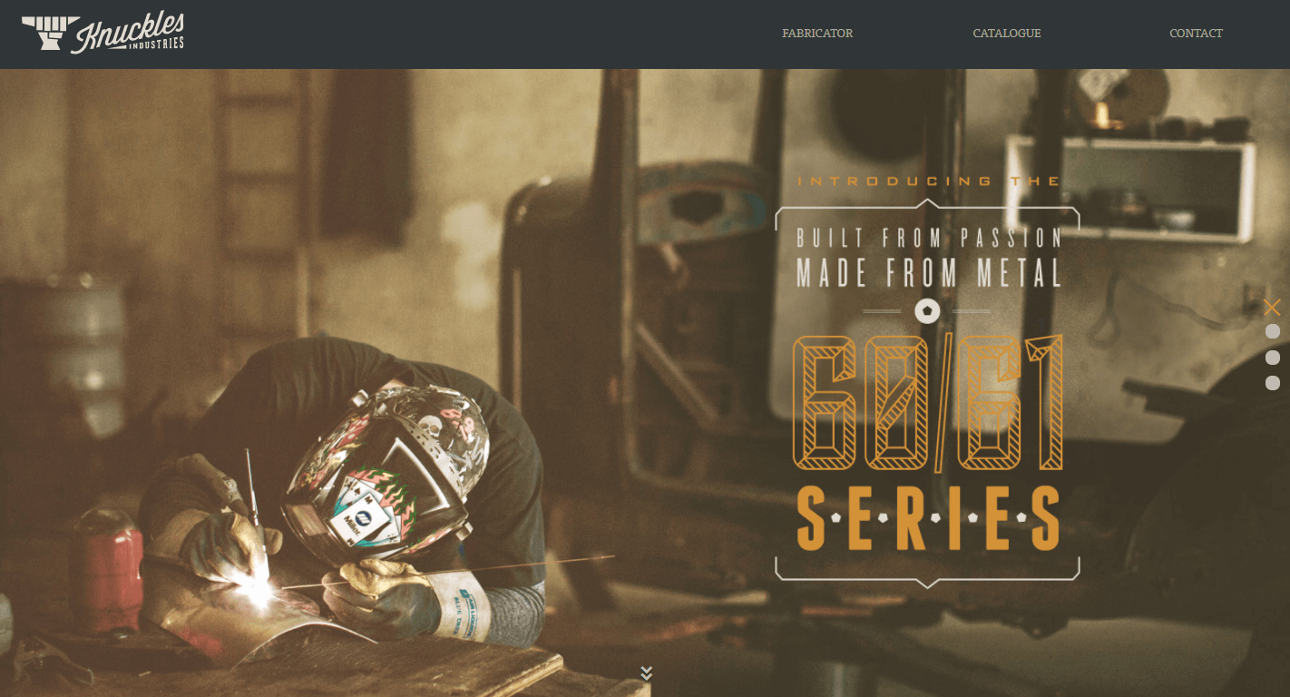
Knuckles Industries
Born out of a love for metal, Knuckles Industries specializes in metal fabrication. Cool, rugged, and youthful. This is the current impression that the site makes. In addition, some of the main takeaways that can serve as inspiration include: their use of vintage-style photos, implementation of full-width parallax design, full-page design, and a minimalistic content architecture.
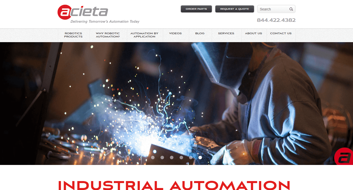
Acieta
Acieta is market leader when it comes to industrial automation technology. They been in the business for over three decades and installed approximately 4,000 robotic systems throughout North America. They specialize in assembly robotics, vision systems, machine tool tending, die casting robotics, and more. The company shows that they do not have boring taste when it comes to their online presence as their website features a responsive website design and stellar utilization of yellow, red, and black contrasting colors. As you can see, the chosen colors flow well with product design.
Homeyer Tool
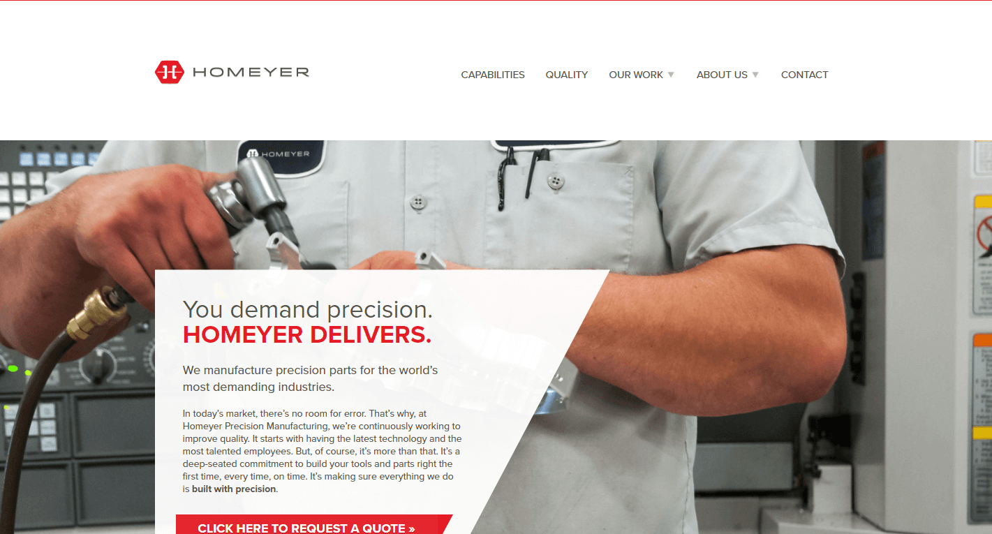
Homeyer Precision Manufacturing is established in 1990 and delivers cutting-edge manufacturing solutions. The company is based in Marthasville, Missouri and delivers precision parts for demanding industries such as military, oil & gas, electronics, aerospace, and more. When it comes to their website design, their focus does not waver one bit. There is a nice color choice of contrasting neutral white and grey tones with the company’s red logo. They are also not afraid to use geometric shapes, straight edges, and sans-serif fonts. All in all, their chosen site design communicates a modern brand.
 Free
Consultation
 Free
Google Ads Audit
