Adding Brand Personality To Your Website

Chad Faith
Director of Content

Brand personality can be simply understood as a set of human traits or characteristics that are associated with a brand name. Furthermore, it sets the brand attitude and is considered to be the key input into the emotional aspect of any marketing or communication activity initiated by the brand. With that in mind, let’s find out how you can add brand personality to your website.

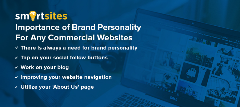
There is Always a Need for Brand Personality
You see, first-time visitors usually arrive at your website and linger for about five seconds and that is all the time you have to convince them to stay on the page, and kick-start a lasting relationship with your brand. However, the process of enticing your visitors to stay is not as simple as just spamming enormous images, fancy flash designs or other resource-intensive web design elements as they tend to slow your site’s load time, which make things even worse.
Tap on Your Social Follow Buttons
One of the best inbound marketing practices is including social media follow buttons on each page of your website. However, if you are using cookie-cutter icons to link to your company presence on popular social media platforms, do note that there is no definite rule saying that those icons need to be adopted. You just need to ensure that the network is clearly recognizable before expressing as much brand personality as you can in your ‘Follow Us’ widget. Remember that your creativity and the sky are the only limits!
Work on Your Blog
Creating and maintaining a blog for commercial websites are an excellent way to express brand personality. When you implement this solid content marketing strategy, you are not limited to just basic blog layouts. Hence, try sprucing up your website content with a fun layout and/or use some sassy widgets. Some of the important rules to keep in mind include making it easy for your visitors to navigate your content, become a subscriber or connect with you on social media.
Improving Your Website Navigation
When it comes to designing website navigation, this task might entail a pretty tricky process. How tricky can that get? Let’s see, you want your website to stand out, but you also want your creation to be easy-to-use and exceptionally intuitive so that visitors can start exploring your web presence without delay. That sounds like a challenge, doesn’t it? For starters, you can consider introducing some elements that are visually-stimulating. Give that a try!
Utilize Your ‘About Us’ Page
You must utilize your About Us page to its fullest potential because it is a great avenue to showcase your uniqueness and how you are better than your competition. For example, your company may be comprised of a large team. You should by all means, let their personalities and interests shine through to provide prospects a comprehensive overview of your talented crew. When you spruce up your About Us page, make sure you cut the technical lingo (save them for service pages or whitepapers) because this page is for you to express who you really are.
 Free
Consultation
 Free
Google Ads Audit


