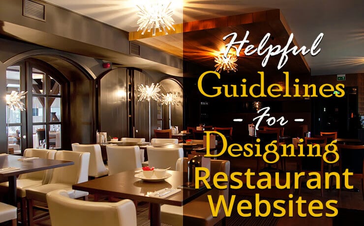
Helpful Guidelines For Designing Restaurant Websites

Chad Faith
Director of Content

There’s no secret – it’s all about the small details when it comes to running a restaurant business. As an owner, one needs to put ample thought into the details of the menu, physical space, and more. If you are designing restaurant websites, you should remember that they deserve an equal amount of attention to detail. Let’s find out some useful web design tips for restaurant websites.
Build Your Restaurant Website on a Responsive Platform
Everyone have their own preferences when it comes to visiting a website. No matter what device they are using, they should enjoy a consistent experience. You see, many people typically device where to eat in a spontaneous manner, i.e., while on the move. So, when someone whips out their phone, starts searching, and manages to find your restaurant, make sure your site is easy to navigate (Psst! WordPress is home to tons of responsive themes and designs). Otherwise, they may just end up dining somewhere else. Don’t lose a potential customer!
Upload High-Quality Photos
Bad photos can make one’s dishes look less appetizing than they are actually are. In other words, they can make a tasty plate of freshly cooked noodles look like overnight noodles that have just been re-heated. Making food look good in photos can be challenging and that’s why there are photographers who specialize in this area.
If you have the budget, engage them. If not, your photos should be used sparingly while you let your descriptions and ingredients shine more. You can also make use of action shots: chefs tossing food on a pan like the pros they are, bartenders shaking up fancy cocktails, and more.
Next, let’s not forget that you can use photos to showcase the ambience of your restaurant. You can let visitors know if your place is ideal for a quiet romantic dinner or socializing. Think about the story you want to tell your audience!
Understand the Clientele
Before you start designing, you should always ask yourself who wants to eat at the restaurant. You need to choose the right layouts, colors, and fonts that appeal to your targeted demographic. You wouldn’t want to use bright, ebullient colors, which are more suited for dessert sites, to represent your fine dining restaurant.
Sometimes design is not only about making the right visual choices. You need to know your audience well enough to know the technologies they usually turn to when they are not sure where to eat. Do they use Yelp reviews? Do they rely on OpenTable to book their meals? It’s this type of integration you need to be aware of. This way, you can also avoid adding bells and whistles that aren’t actually needed.
Make Sure Your Menu is Both Concise and Appetizing
Your online menu must always be on point. This means no unnecessary lengthy descriptions that might bore your audience. Simply use the right amount of descriptive language for your dishes’ names and let the list of ingredients do the bulk of the talking for your fine creations. In addition, you should logically organize your dishes by breakfast, lunch, dinner, and supper. You get the picture. Got gluten-free food to flaunt? Point that out!
If you are thinking about posting menu in PDF format, stop right there. It is much more effective to feature your online menu as an individual web page. Looking for inspirations for menu designs?
Minimalism Helps
Whether you manage a Michelin star restaurant or a humble cafe, you should always keep your site’s content to a minimum. If you are hungry and looking at a restaurant website, will you have the patience to wade through complex navigational options or lengthy descriptions?
Cut to the chase. Here are the basic things that a restaurant website needs:
- Special events page
- Operating hours
- Contact information
- Menu
- Location
- Bookings page
Well, designing a restaurant website isn’t so hard after all, isn’t it? But of course, if you need help, then you can always use a stellar restaurant website design and development service.
 Free
Consultation
 Free
Google Ads Audit


