What Makes A Modern Website?

Clement Foo
Senior Digital Content Manager
When various web design elements are incorporated thoughtfully, they can tell beautiful stories, as well as explain the missions and values of companies. Although new design trends surface regularly, one does not need to include every trend that comes about on his or her website. Fortunately, there are many timeless design elements that can help improve one’s visitors’ experiences. To help you focus better, below are some of the most important modern web design elements to consider implementing:
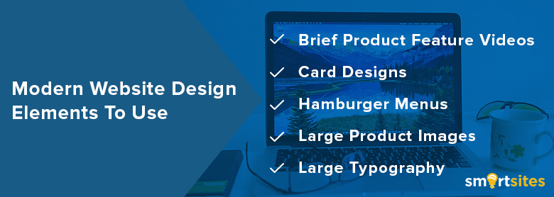
Brief Product Feature Videos
Today, more companies are choosing to feature short product videos that highlight a specific use case. These videos are great at breathing life into your products and services without overwhelming the visitor. This technique works exceptionally for B2B companies such as agencies that provide consulting services, IT services, and more. Many B2B customers watch online videos when researching services and products for their businesses. By creating such videos, one has a better chance of influencing the buyer’s decision-making process. A word of caution; avoid creating lengthy videos. Simply keep things short and ensure that your content can be understood quickly. This type of video is best for top of the funnel.
Card Designs
Due to the rise of Pinterest, marketers and designers alike have become fascinated with card designs. These design elements allow B2B and B2C business owners to disseminate information in a visual manner and in bite-sized pieces. Oftentimes, card designs involve breaking up different pieces of content into a card format. Visitors then pick and expand articles that interest them.
Card designs can help one maintain a clean and organized homepage because they do not require a lot of text. In order to increase the effectiveness of card designs, they need to be responsive and can adapt to different screen sizes.
Hamburger Menus
If you browse through other established websites, you can spot an icon (usually at the top of the page) that is comprised of three lines stacked on top of each other. Don’t they look like hamburger patties placed on top of one another? That’s how hamburger menus got their name. It is important that one implements this feature if his or her website has a long menu of options to choose from. These menus can help create cleaner user experiences.
This is a great web design element to have if you also want a menu that takes visitors directly to where they want to go. When a visitor can find the information he or she needs, the likelihood of completing a desired action will be higher.
Large Product Images
While you are busy creating videos for your website, don’t forget to shoot product images as well. Larger product images can help business owners highlight different parts and features of a product in a more effective and efficient way. Instead of using chunks of uninterrupted text, make the images scan-friendly. Help visitors gain a solid understanding of what the service or product is about by conveying the main message through attractive and meaningful images.
Large Typography
Today, each company uses a particular typography that helps customers distinguish it from its competitors. In recent years, a larger selection of fonts has been released. Designers have more freedom when it comes to expressing themselves through typography.
When one builds his or her company’s brand, the choice of typography can showcase subtle hints about who you are. It can indicate that you are informational, functional, serious, fun, casual, and more. Regardless of what font you choose, don’t forget to consider the font’s applicability across computers and browsers. Otherwise, your website may display awkwardly.
 Free
Consultation
 Free
Google Ads Audit


