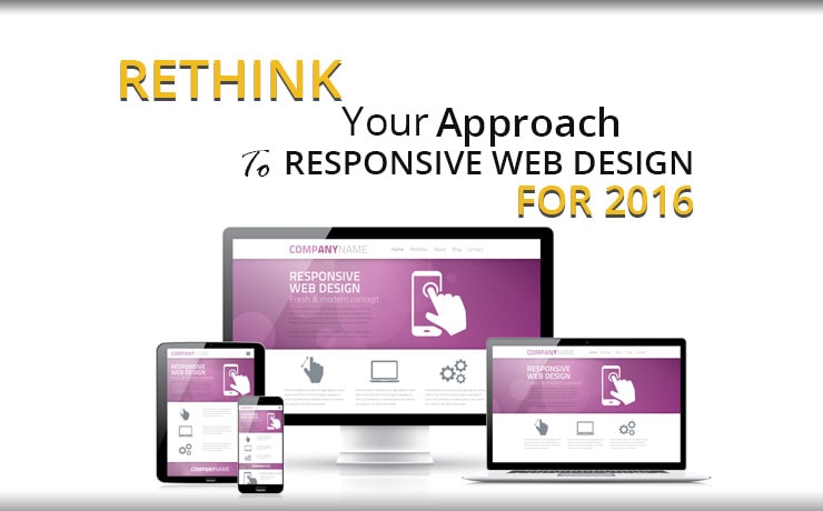
Rethink Your Approach To Responsive Web Design For 2016

Chad Faith
Director of Content

The mobile web is growing at a very steady rate, and Google has confirmed that it is ranking web pages based on their responsiveness now. Hence, it is vital that your website has the ability to adapt to a good array of screen sizes and devices. When it comes to responsive web design, it’s more than just squeezing and stretching your site’s layout to adapt. It is more about being able to deliver a single website in different ways while retaining both functionality and content. Read on to find out how you can design your website so that it’s responsive.
Your Content is Important as Always
You should never fall into the trap of a fit-to-size approach. Your main focus should never be on fitting all existing elements onto a new page without considering their context. Begin by focusing on the most important features and content. In some cases, not all elements make the cut and you will have to question their inclusion as you move from one screen size to another. You will know that you won’t need a particular element when you think about it for too long.
You should always prioritize your site’s elements based on their importance to the potential user. Sure, you can fix some text next to an image and it works well in desktop view but you will want to rethink what works best at capturing your user’s attention on a mobile device. In some cases, you will want to forgo the use of accompanying blog images on a preview page for mobile devices. The main focus should be on the content itself.
Use Modern Layouts that Include Infinite Scrolling
When you are on the features and content you need, focusing on the layout is the next step. The traditional concept of above the fold does not apply here as people are now used to infinite scrolling. Sites like Twitter and Facebook encourages scrolling whilst maintaining important information at the top. This can include CTAs, contact information as well as add to cart buttons for eCommerce websites.
The Game has Changed – Images Take the Center Stage
High quality images are one the key components of a successful responsive website design. In fact, they can help form your visitors’ first impressions. However, you should be cautious when using images as they can have a negative impact on the download speeds of mobile devices. Apart from questioning the inclusion of an image, you will need to ensure that they are optimized by saving them in an appropriate format and make them flexible with adaptive sizing. If you want to include elements such as image galleries, opt for horizontal swiping functions, or long-scrolling navigation features.
Choose the Right Typography
Certain typefaces can become too difficult to read properly after being reduced on a smaller-sized screen. You will have to ensure that you perform thorough testing across different screen sizes to avoid this problem. In addition, your headings should be balanced and their function needs to be direct and obvious. If they are too large, they can appear too dominant. The length of your content matters too because it can be difficult to read if it’s too long, so keep line lengths to no more than 75 characters. Also, there must be adequate contrast between the fonts and background color.
 Free
Consultation
 Free
Google Ads Audit


