The Anatomy Of A Conversion-Friendly Email [Infographic]

Ashley Ismailovski
Director of Email Marketing
Subscribers are drawn in by engaging, simple, and crisp email designs filled with dynamic content. This allows them to build a brand/subscriber relationship. It’s important to understand how email designs play an important role in the fulfillment of your customers’ needs, and to understand what they’re looking for when the goal is increased conversion rates.
What do consumers want? They want to feel included in brand messaging. They want to feel understood. They want honesty from brands. From various services, they’re looking for instant gratification and to have their “pain points” alleviated quickly. When your values are in line with the values of your consumer, email conversion rates climb.
Here, we’re going to examine the creation of a conversion-friendly email and its importance.
Conversion-Centered Design – What Is It?
How do lead conversion and email design relate to each other? A very crucial role is played by email design where lead conversion is concerned. How subscribers connect with your brand is influenced by various email aspects. To engage with audiences, you need creativity. Here are some essential elements where creativity should be used:
- Responsive design
- Calls to action
- Simple layouts
- Imagery
- Design grids
Conversion-centered design has a handful of principles. They can be broken down into the following:
- Attention – From your traffic source, you’ll start by grabbing the attention of your readers, such as with a promotional email.
- Context – Convince your reader that, by clicking on a CTA (Call to Action) or taking some other similar action, they can learn more.
- Clarity – By detailing the worth of your service/product to the reader, and describing the service or product itself, you can explain your campaign’s value.
- Congruence – Align your design and copy to your mission (getting conversions).
- Credibility – Build your social proof, such as your testimonials or reviews.
- Closing – See to it that your viewers comprehend why action needs to be taken now. Capitalize on your CTA impact.
- Continuance – Encourage returning customers and follow-up.
Email Marketing Conversion-Centered Design Tips
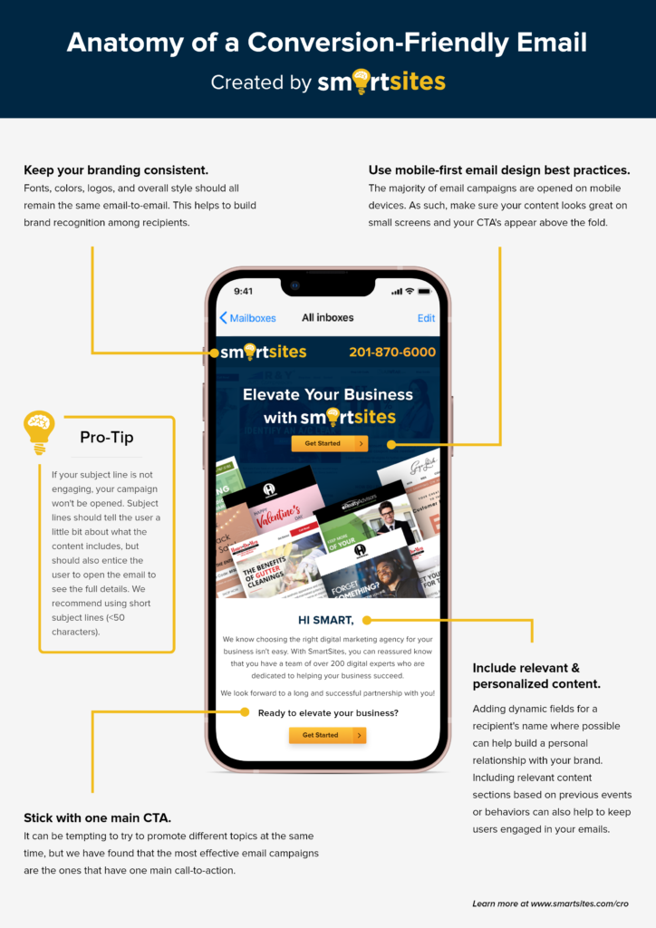
- Emails that are mobile-friendly: You should have a responsive, mobile-friendly email design. However, for mobile users, it’s also important to optimize your website. Through the use of mobile devices like smartphones, website landing pages are being visited more often – just like emails. This is why it’s very important for your website to be updated for mobile users.
- Email design that’s responsive: Mobile devices are opening approximately 63% of email today. When it comes to conversions, it’s important to have a responsive, effective design for mobile. Via your customers’ phones, every email should be as easy to read, clutter-free, and fluid as it would be on a desktop.
- Calls to action should stand out: Beyond the email platform, you want your subscribers to interact with your brand. How do you encourage them? Customer conversion can rely greatly on a “Call to Action” or “Next Step” in every email. Your customers should be linked to your site and your CTA should be “Shop Now!” Another helpful blog post might be hyperlinked by “Read More Here”.
- Content breakup: Without too many distractions, it’s important every email be visually pleasing and simple. Divide each section easily and effectively when sending emails with multiple information layers. This can be done by creating geometric shapes, horizontal borders, interactive maps, and other easy-to-read design layouts. When, through segmented lists, you use targeted marketing, this is an especially effective tool.
- Grab attention: With colors, graphics, and bright imagery, grab the attention of your clients. Your brand should be matched with every image, font, and color within your emails. Build trust and increase email personalization by staying in line with brand voice and brand messaging. Click throughs and engagement increases when email designs build subscriber trust.
- Guide your subscribers with email design grids: You can actually guide customers through specific email design grids, allowing them engagement with your content. The design should deliver your campaign’s key message with a strong headline. To encourage subscribers to engage with the email and click through, it should also contain supporting imagery and materials.
- Finalization: Conversion rates can be drastically increased through the use of creative email design. Subscribers are likely to want to learn more if they like what they’re reading and seeing.
Need Some Help with Digital Marketing? Turn to SmartSites
At SmartSites, we are real people delivering real results. We absolutely love what we do, and we are proud of the assistance we’ve given our customers. If you could use some help with CRO, SEO, PPC, web design, etc., you can turn to us. If you’d like to speak to one of our representatives, please phone us at 201-870-6000. You can also email us at contact@smartsites.com. If you prefer, use our convenient online form to open the lines of communication.
 Free
Consultation
 Free
Google Ads Audit
