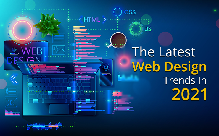
Here, we are going to introduce you to some web design trends in 2021 that each accommodate separate user personas and industries. What’s important to remember is that it isn’t merely an aesthetic decision to implement these styles. Between quality and quantity, it is, more or less, a balancing act.
What that means is web creation goals may not be achieved by applying as many trends as possible to one website. What will positively impact your viewers and their course of action will be the decisions made regarding which specific trend suits your business goals.
Now, on to the 2021 website trends…
Hover Gallery Menu
One of the interface’s most fundamental elements is the website menu. Where several design trends are concerned, website menus have been the epicenter. A “half navigator menu, half hover gallery menu” is putting a new spin on the menu structure’s traditional appearance and use. At face value, it appears as a standard, regular menu. Images appear, however, once they’re hovered over, revealing a content sneak peek.
But wait… there’s more! A different image is displayed by each separate menu item over which you hover, indicating the varied, rich experiences awaiting you on every soon-to-be-encountered page.
Seamless Surrealism
Designing websites in a surrealist style is an art trend being taken even further by some designers. Characterizing this technique is the positioning of elements upon unusual, counterintuitive backgrounds.
Also involved in surrealism web design are textures and flamboyant colors representing the creator’s abstract, artistic mind. To present their products in an emotional, novel way, more and more e-commerce websites are turning to this trend.
Collage Art
Though formerly rare in digital media, the collage art concept was not uncommon in media types such as posters, magazines, and newspapers. Through social media, this is changing. The field of web design has now integrated collages into their pages.
Atypical and Creative Product Photos
To provide a visual solution to formerly unrealistic pictures of products, 3D simulations are now being used by many e-commerce stores. For 2021, we expect to see extremely high resolutions and detailed intricacies along with 3D visual techniques that are even further enhanced.
Simple Shapes
Web design trends are breathing new life into the old 90s era artistic style. This time around, integrated throughout design schemes, you will see simple shape motifs. No depth or texture and merely one shade of color is used in these two-dimensional, simplistic shape illustrations.
Black Outline
Throughout their website, some web designers are using black outlines around various elements. Varying in thickness, these borders and black outlines frequently are used to divide pages. With real photographed images, these illustrations and black lines are being combined for new and exciting design elements.
Textured Black-And-White Illustrations
Formally drawn by hand (when the journalism industry relied on black and white illustrations because there was no color), it is now possible to digitally create texture-based illustrations. This style can be viewed on MailChimp’s homepage.
Negative Colors
Very bold colors are being used by more and more web designers. Primary colors such as yellow, blue, and red are being emphasized. Accentuating an exciting, upbeat vibe, these color pallets can attract audiences of a younger age group.
Light Colors
One of the biggest differences between web design and print is the use of light colors in interface and web design. Possibly preferred over bolder, dark colors, light colors do not become compromised as they do in designs that are printed. They become more turbid and opaque, losing their richness when used in print.
Emoji Use
Digital interaction has been embraced by worldwide communication. Today, an essential part of our digital lexicon is playful emojis accompanying alphanumeric characters for texts that have gone far beyond words. So, in a web designer’s toolbox, emojis have a definite place.
Playful Typography Animations and Effects
Contrary to the standard sentence font using left to right, today an animated string of words may be structured. For decorative purposes, a collection of words or a sentence can be presented with animated typographic features or as a particular shape.
Elegant Serif Fonts
Changing with the times is the old belief that the go-to font style for web design should be sans serif fonts. For their simple structure and sleek legibility, they’ve always been loved by web designers. Today, however, screen resolutions and sizes are clearer and larger than ever before. Designers have come to love some specific serif font families. Think Times or Georgia, or the lesser-known fonts like Noe Display or Portrait.
Are You a Trendsetter?
New opportunities will be present in 2021. By being a standout in your competitive landscape, you can embrace 2021’s design trends. In return, visitors will be attracted. With their own relevant use-case, these individual trends need to be integrated carefully. It must be done in accordance to your audience’s interests and your brand’s design language.
Of course, all of the above is merely the tip of the iceberg regarding what’s ahead of us for future trends. There will be far more to do and see. To stay ahead of the game with PPC advertising, web design, organic SEO, and more, work with SmartSites. We are an award-winning agency involved in the digital world of marketing. Through extensive work and an innovative vision, we have become one of the fastest growing companies in America. For all things digital, we have a serious passion! We’d like to share it with you.
 Free
Consultation
 Free
Google Ads Audit


