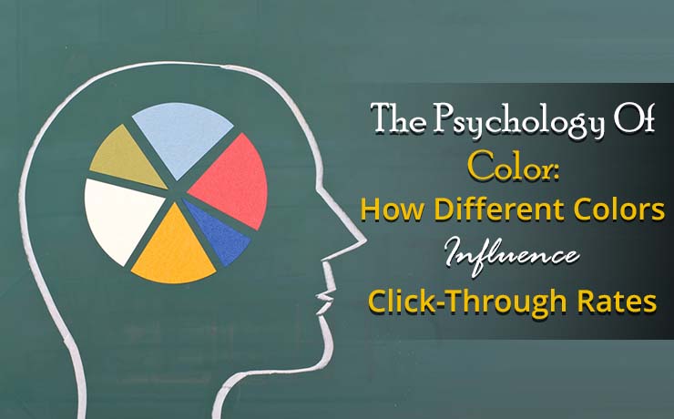
The Psychology of Color: How Different Colors Influence Click-Through Rates

Natalia Rivera
Project Manager
Every element on your website, from images to text, plays an important role in capturing your audience’s attention and driving engagement. Amongst these elements is color. Color holds a unique power to influence perception, emotion, and ultimately, click-through rates (CTRs).
We’re going to dive into the psychology of color and explore how different colors can trigger different emotions and guide user behavior.
The Emotional Impact of Colors
Colors have a huge impact on our emotions and can evoke a wide range of feelings. For instance:
- Red: Passion and Energy
Red is often described as the most intense and attention-grabbing color. It’s associated with intensity, passion, energy, and danger. A study conducted in 2020 found that red can increase heart rate and blood pressure, making it a strong tool for guiding emotions and actions. It’s commonly used to create a sense of urgency, excitement, or desire.
Real-world examples: Netflix, Coca-Cola, Toyota
- Orange: Playful and Enthusiastic
Orange is a combination of the primary colors red and yellow, combining the passion of red with the warmth of yellow. It’s often known to boost creativity, enthusiasm, and excitement. Orange can also stimulate appetite, making it a popular choice for restaurants and food marketing.
Real-world examples: Dunkin Donuts, Reese’s, The Home Depot
- Yellow: Optimism and Happiness
Yellow is a happy and optimistic color that can stimulate the brain and increase feelings of positivity. However, too much of a good thing ends up being a bad thing. Excessive amounts of yellow can be overwhelming and irritating to the viewer, causing visual fatigue. It’s often used to attract attention and create a sense of warmth and friendliness but it’s important to be careful that you are not overusing it.
Real-world examples: Snapchat, Ferrari, Batman
- Green: Growth and Harmony
Green is often seen as nature, growth, and harmony. It can give feelings of peace, balance, and new beginnings. Green is also a color of hope and optimism, making it a popular choice for environmental and eco-friendly brands.
Real-world examples: Heineken, Animal Planet, Publix
- Blue: Trust and Calmness
Blue is one of the most versatile colors. Often viewed as calming and trustworthy, yet is also associated with sadness. It’s in the sky and water, boosting feelings of peace, serenity, and reliability in the natural world around us. Blue can also have a soothing effect on the mind and body, making it a popular choice for corporate branding and healthcare businesses.
Real-world examples: American Express, Skype, Facebook
- Purple: Royalty and Luxury
Purple is a luxurious color of royalty, often associated with sophistication, mystery, and wisdom. It has been known to increase creativity, spirituality, and independence. Purple is often used in high-end or premium products and luxury brands and businesses.
Real-world examples: Cadbury, Hallmark, LA Lakers
Color Psychology in Online Marketing
Understanding the emotional impact of colors is essential for effective digital marketing. By carefully selecting colors, digital marketers can create a visual identity that resonates with the appropriate target audience and drives engagement. Here are some key strategies:
- Leveraging Color to Build Brand Identity
The right color(s) establishes a brand’s identity and creates a lasting impression on consumers. By carefully selecting colors that align with your brand’s values and messaging, you can evoke specific emotions and create a consistent visual experience. For example, a tech company might opt for blue to convey trust and reliability, while a fashion brand might use purple to show sophistication and luxury.
- Using Color to Create a Call-to-Action
Colors can be used to draw attention to specific elements on your website or marketing materials, such as call-to-action buttons or headlines. For instance, a red “Buy Now” button can create a sense of urgency and encourage immediate action. Conversely, a blue “Learn More” button can convey a more relaxed and informative tone.
- Color Contrast for Improved Readability
Effective use of color can also improve readability and visual hierarchy. By creating sufficient contrast between text and background colors, you can make your content easier to read and navigate. For example, using a dark text color on a light background can enhance readability, while a lighter text color on a darker background can create a more sophisticated and modern look.
- Color Psychology and User Experience
Color can significantly impact the overall user experience of your website or marketing materials. By using colors that evoke positive emotions and create a visually appealing design, you can improve user engagement and encourage conversions. Conversely, using colors that are difficult to read or evoke negative emotions can hinder user experience and drive away potential customers.
- A/B Testing to Optimize Color Choices
To determine the most effective color combinations for your brand, consider conducting A/B testing. This involves creating two versions of your website or marketing materials with different color schemes and measuring their performance. By comparing the results, you can identify which color combinations are most effective in driving engagement and conversions.
Measuring the Impact of Color on Click-Through Rates
By understanding the principles of color psychology and applying them to your marketing efforts, you can create a more engaging and effective brand experience that resonates with your target audience and drives results.
To determine the effectiveness of your color choices, it’s important to track and measure their impact on CTRs and other relevant metrics. A/B testing can be a valuable tool for comparing different color schemes and identifying the most effective combinations.
More than just aesthetics, color is a powerful tool in digital marketing. It can shape perceptions, evoke emotions, and influence behavior. Understanding color psychology allows you to create a visually compelling and impactful brand experience that resonates with your target audience. By carefully selecting colors that align with your brand’s values and guide the desired emotions, you can influence behavior, drive engagement, improve click-through rates, and ultimately achieve your digital marketing goals.
 Free
Consultation
Free
Consultation Free
Google Ads Audit
Free
Google Ads Audit