What’s Important In Mobile First Web Design?

Clement Foo
Senior Digital Content Manager

More people than ever before are browsing the net on their mobile phones today. This phenomenon has grown so much that Google has even included mobile friendliness as a factor in its search algorithm. Amidst this new development, your business website can no longer afford to fall behind on a mobile first web design. Ask yourself this: when your website was first designed, was it with a desktop view or mobile view in mind? If your answer is the former, you may have some work to do. Even if it was designed with a mobile view in mind, is it working as intended? Do some images, icons or chunks of text still look out of place?
In this article, we share with you what’s really important about a mobile first web design.
Why A Mobile First Web Design is Important
Everywhere we go today, we can see groups of people huddled over their smartphones. Regardless of what they are using it for – answering messages, looking for products to buy or searching for an answer to a question – it cannot be denied that mobile search results have surpassed desktop search ever since 2016. Hence, it would be a big mistake to continue focusing on a web-first design.
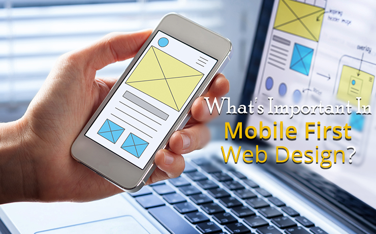
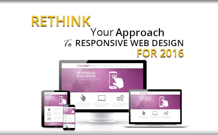
As implied by the name, a “mobile first” design means thinking about how your website will look from a mobile device first, then working around that to accommodate it for desktop viewers. The norm used to be the other way round and in fact, some businesses are still doing things that way. Instead of designing two sites separately, a feature known as mobile responsiveness allows your website to be scaled up or down to fit the exact screen size of a device.
If your website is not mobile responsive, what will happen is that users can quickly navigate away. Nobody wants to be constantly zooming in and scrolling left and right just to read a chunk of text. As this problem is easily overcome by adopting a mobile first web design, there is no reason businesses have to lose customers due to it.
Focus on Content and Messaging
Sure, we all know that images are necessary to capture the attention of viewers. However, on a mobile first website, images can slow down the loading speed. Although that does not mean images should be excluded, what it does mean is that the first thing you should focus on is content and messaging. Ensuring that your tabs and text show up in the right place is key to communicating important information about your brand and helping visitors navigate through your site seamlessly. When you have got that right, it’s time to insert the images.
The Importance of Images in Web Design
Regardless of whether a viewer is accessing your website through desktop, mobile or tablet, images are extremely important for capturing and retaining their attention. Nobody wants to read a chunk of text that goes on and on without any diversion. Sure, paragraphs and headings help to break up long chunks of text, but images can capture attention in a way that text cannot. Today, mobile users expect the images they see to be of the same quality as what they would view on desktop, and there is no reason why you cannot offer them that.
While this does not mean that you should overload your site with images at the expense of loading speed, it does mean that you have to choose your images carefully and compress them. Having chosen images added specifically with mobile devices in mind will go a long way to enhance user experience.
Images Contribute to User Experience
Some people may have the misconception that a website that is easy to navigate has to be simple and therefore, dull or boring. That is not true. By adding thoughtfully selected images in strategic spots, you are enhancing the user experience of your visitors. This, in turn, means that they will stay longer on your website, which bodes well for your SERP rankings. When visitors stay longer on your site, Google marks that as a point in your favor that the customer finds your website to be relevant and useful. Google is always trying to show the most relevant results to customers, so it’s no surprise that the longer visitors stay on your page, the better it is for your SEO efforts.
To this effect, you should consider the colors of the image you are using against your background. Bright, bold colors work best against a white or light colored background. Images should also be interactive and easy to manipulate using the touch screen. The guideline set by Apple is that images have to be at least 44 pixels in order for users to easily manipulate with their fingers.
Although you may not be able to display multiple images side by side like you can with a desktop view, there is no doubt that images still retain the power to pack a punch on a mobile first web design. Excluding graphics completely is out of the question, regardless of which version of the website your user is viewing.
Engage A Web Design Digital Marketing Agency
Web design is one aspect of digital marketing that can get overlooked amidst PPC and SEO campaigns, amongst other things. However, it is of vital importance, especially now that an increasing number of users are browsing through mobile. If you already have a vision and look you want for your website, you may be having trouble expressing that on the screen. Here is where a digital marketing agency that specializes in web design can help. Many businesses outsource their web design efforts – not only do agencies have the experience and expertise to translate your vision into reality, they can assist with other factors such as ease of navigation and mobile responsiveness. Web design is an important part of your branding and therefore, it quite literally pays to invest in it.
 Free
Consultation
 Free
Google Ads Audit


